In this post, we will share more about our mass adoption strategy, as well as some of the user experience improvements we are making based on the usability testing sessions that we conduct.

Goals and Strategy
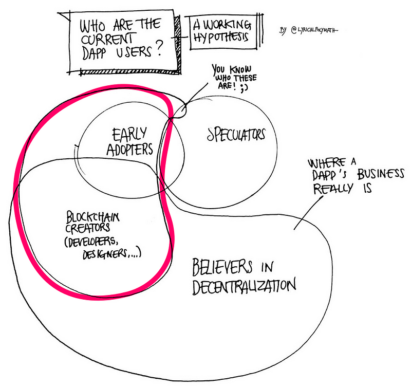
We believe that current users who try and use blockchain applications are early adopters as well as blockchain creators (developers, designers, and everyone else involved in the making of this technology). @lyricalpolymath created a drawing (shared below), that expands on this notion by including other audiences. We have further dissected this drawing to distinguish between the present and the aspirational future, which we are co-creating. The first version below illustrates the present, as we see it (current users are included in the magenta outline).
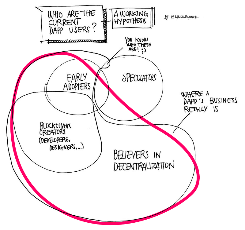
The second version illustrates the aspirational future (the users we would like to capture as an audience are again included in the magenta outline).
Once we have a solid footing with the audiences mentioned above, we plan to spread blockchain applications beyond them, and bring our æpps to users without a special interest in blockchain and/or decentralization.
Improving Usability by Reducing Friction
By focusing on the expansion, from creators of the blockchain ecosystem to supporters of decentralization and other groups, we are making sure that the latter two audiences can complete all the core tasks of our Bæse æpp with ease. In our last testing session, we validated the following crucial user pathways/behaviors:
- The initial onboarding experience
- Navigating between the wallet/accounts functionality and æpps browsing experience in the Bæse æpp
- Sending and receiving AE tokens
- Switching between accounts
Below we are sharing some of the observations we made, as well as the improvements we incorporated to address the identified user-experience issues.
User Experience Improvements
We carried out the testing with users with varying levels of experience, representing different user personas, such as “someone involved in the building of the crypto ecosystem,” a “believer in decentralization,” and an “early adopter”. For anyone who is part of the decentralized ecosystem and has ventured into the usability of the applications within it, it is quite easy to notice that here, even more so than in traditional applications, whether or not the user is familiar with the overarching concepts plays a huge role in their ability to interact with the application/product.
Conditional Tips
We noticed that for users more familiar with blockchain applications, certain user interface elements can be quite straightforward. However, for users who believe in decentralization, but have far less experience with blockchain technology, the purpose of these user interface elements can be unclear. To solve this
we introduced conditional tooltips, which explain the purpose of each UI element.

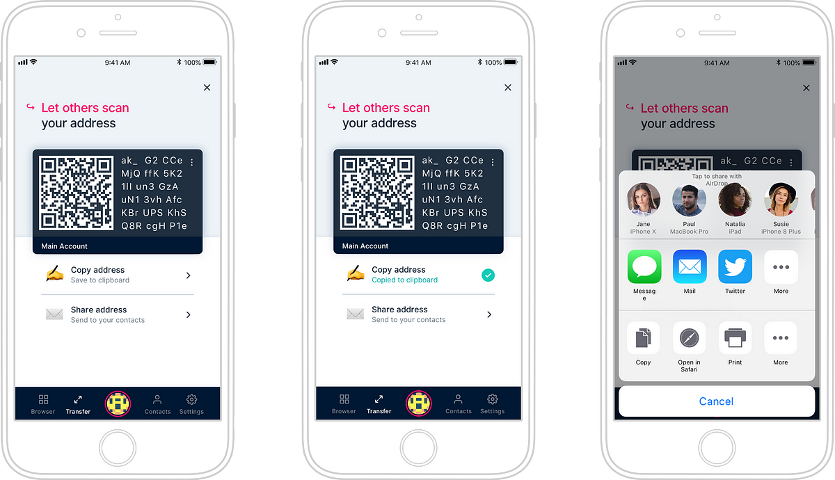
For example, on the account activation/switching screen, where users arrive after they login/register, we introduce all elements via the above-mentioned tip panels. This makes it clear to users of all experience levels what each UI element does. In the screenshot above, we put these to use by showing how we use account cards, where the account switching option is, and how we use identicons, as well as the navigation options in the main navigation bar.
Navigating Between Contexts
The Bæse æpp offers users the ability to transfer AE tokens between accounts (belonging to the same user or between different users). It also allows users to browse and launch applications running on the æternity blockchain (æpps). Switching between making transactions in the wallet and the browsing/using æpps interfaces (both of which live within the Bæse æpp), turned out to be confusing to our testers, especially the ones who were less experienced with blockchain æpps.

For this reason, we reintroduced a traditional navigation bar at the bottom of the Bæse æpp, with clear “Browser,” “Wallet,” “Activity,” and “Settings” labels (and corresponding icons). The same bar also includes an indicator of which is the current active account, allowing the user to switch accounts.
Initiating Transactions
Another pattern, which we identified when analyzing the behavior of our test group, is that certain terminology related to the different ways of initiating transactions can be confusing. For example, calls to action such as “initiate a transaction” or “transfer tokens to another user” or “transfer tokens between your accounts” could baffle users. We found out that in order to make the transfer options clear to every user, we need to group them into “Send” and “Receive” options. Only when a user has selected “Send,” for example, should they be prompted to choose what account they are sending the funds to (e.g., another user or another account they own).

Similarly, when users would like to receive funds they first choose the “Receive” option in the wallet and only then are they prompted to make a secondary choice of how they would like to share the address for the active account.
The Journey Continues…
These are only a few of the improvements which we made based on recent usability testing results. We continue to work tirelessly to improve our process and remove barriers as well as friction points from æternity’s æpps. This is a crucial step to bringing blockchain technology to mass adoption. Stay tuned for more posts, where we share details about our process and further usability improvements.
Interested in æternity? Get in touch:
GitHub | Forum | Reddit | Telegram | Twitter | Facebook | Mail

Leave a Reply